Quick post as I have no time to work on this for now. Ages ago I read a book, I think by Arthur C. Clarke, where powerful atomic bombs were used to generate radar pulses so powerful, the return signal was used to map the entire solar system in one go. The grandeur of this vision impressed me a lot, and I hope that one day we can do it. (Btw, if anybody knows the name of the book, please share!).
If you send out one powerful ‘ping’ of radar signal, and only measure the strength of the return over time, you don’t get a good picture – you learn how much reflection you get, and from how far away (based on the delay). But you don’t get the angle. This is why ‘real’ radars rotate, so they can sweep the sky. (I know there are other reasons).
One of the 2012 goals for the PowerDNS Recursor is to become the DNS resolver with the best perceived experience for the end-users. This means not so much the highest performance (in terms of hundreds of thousands of queries/second, the usual metric), but in terms of getting the best answer to the user within the shortest amount of time.
In doing the math on this challenge, I needed to know how the response times of authoritative DNS servers are distributed, so I instrumented the PowerDNS Recursor to graph this while I sent it runs of 2,000,000 questions from a list of the most popular domain names. I was naively expecting some sort of Poisson distribution centered around 150ms.
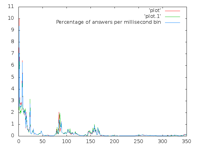
But lo and behold, I got this graph. From this you can see that around 10% of answers came in beteen 1 and 2msec. But this graph isn’t any kind of nice smooth distribution at all, and I should have realised that.
(the graph contains two runs, called ‘plot’ and ‘plot.1’, plus the combination of both runs in Blue)
The speed of light within a fiberoptic cable is around 200,000km/s, and because the answer needs to come back too, this equals around 100km per msec. So if you multiply the y-axis by a hundred, you get a very rough measure of the distance of all authoritative servers queried. And servers are not distributed smoothly! They tend to cluster around hotspots.
So what are these peaks? Well.. the first one turns out to be mostly ANYcasted servers present very closely to xs.powerdns.com. A secondary peak (24ms) appears to be Milan (actual distance: 1000km, but we lose 20ms somewhere within Level3 for no apparent reason), hosting an instance of a.dns.it, plus an instance of b.gtld-servers.net in Stockholm (actual distance: 1500km).
The big void between 50ms and 75ms might correspond to the Atlantic Ocean.
The peak around 84-87ms matches closely with the East Coast of the US, whereas the somewhat broader peak beyond 158ms might well be California. Or Asia!
250ms is about what you’d expect from Australia, the peak from 350ms might again be Australia, but then ‘the wrong way round’.
These analyses are very tentative, but I’ve now seen the same result on 4 different datasets, one of which was measured a few years ago and based on very different techniques, but gave the same result.
The dataset used to generate the graph above can be found on http://xs.powerdns.com/dns-radar, the format is “microseconds errorcode remote-server:port domain-name”.
I might publish more details on how to reproduce later, but for now, I thought this was cool enough to share!


